A month ago I asked Web User how they had the cheek to review other websites when theirs had such a tiny font and was laid out with tables. They replied that they agreed and were looking forward to their new design. It’s now here in beata.
I think we can agree that (1) it’s much better and (2) they must be the most organised people in the world if they can remember to tweet someone a month later asking what they think of their new look!
Also, they’re going about the redesign in a sensible way. They’ve launched it as a beta – this gives them a change to get feedback, correct any errors and generally warm people up to the idea. Not like that godawful Delia Smith relaunch.
However, here are 5 changes I’d make before it goes fully live.
1 Adjust the IA
They used to have 5 main categories. They’ve now got 11 – too many to get your head round. I’d go back to fewer if I were them – for instance, I found the old ‘Product reviews’ label a lot clearer than the new ‘products’ label.

My recommended list of main categories would be:
- News, blogs & podcasts
- Hardware, software & website reviews (which would also include the games section). This could be just ‘Product & website reviews’ if my suggestion is too long.
- Help & advice (which would include broadband, especially the broadband advice section; and also the video section as they are all advice videos).
- Forums
I’ve cut the number but given them longer titles to make it much clearer what each one is.
The current win and magazine ‘sections’ could be kept, but I would treat them differently visually. They aren’t the same sort of thing as the main categories.
2 What’s a link?
Make links clearer
I think the visual language and the use of labels needs adjusting – at the moment some headings are links and some aren’t, and it’s not clear which is which.
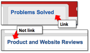
So on the home page, the big ‘Problems solved’ heading is a link but ‘Product and Website reviews’ isn’t. This isn’t clear visually.
 The problem is partly caused by the IA issue – they’ve combined the reviews under the heading but because the reviews are split across sections, the heading can’t be a link to just one section. My IA / labelling suggestion will fix this.
Making it more obvious what’s a link will hopefully enable to ditch the ‘All ….’ and ‘More ….’ links which are a bit of a mess and should be unnecessary.
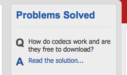
The same also applies to the ‘Read the solution’ links (just make the Q the link – this will also be better for SEO).
3 Watch for tiny text

Font is too small
There’s good use of typography in general. But occasionally some tiny text has snuck in – I never like to see font-size:x-small …
4 Fill the category pages
There’s not much on some category pages – this is probably the IA point again….
5 Make the newsletter sign up box clearer
I’d put some information about the benefits in this box – give me some motivation to click it.
Right, I hope those helped …
If it was me, I’d reconsider what’s the most important thing for the homepage. Is it really news? They know their users better than me, but I wonder if news is really the most important section as its position at the top implies …
You might also like
- On the usability of taps and the lessons for web design
- Design, readability and websites
- New design trend: Logos that change to show you they’re a ‘home’ link
- How many Diggs you need to get the nofollow taken off
- Breadcrumb navigation trails and WordPress
Leave a comment!